To Be, Or Not To Be...
W.S.
I might also have called this ‘colour or black & white’, but Shakespeare rocks, so I went with the current title.
Nick Melidonis recently wrote in Better Photography 89 that “stripping away colour is the first step towards embracing the abstract”. Colour is intoxicating. If you jump on Instagram or 500px and look at the photographs, you’ll quickly see that vibrant colour (sometimes saturation) makes images more appealing. As human beings, we are predisposed to colour like we are predisposed to sugar and fat.
But colour is also a distraction. Black and white imagery (good black and white imagery) is sustained by good composition. Without that it has nothing else to hang its hat on. That doesn’t mean you should only shoot in black and white: shoot colour and then convert. But shooting only in black and white does focus the mind on shape and form, as Richard White suggests in Better Photography 85.
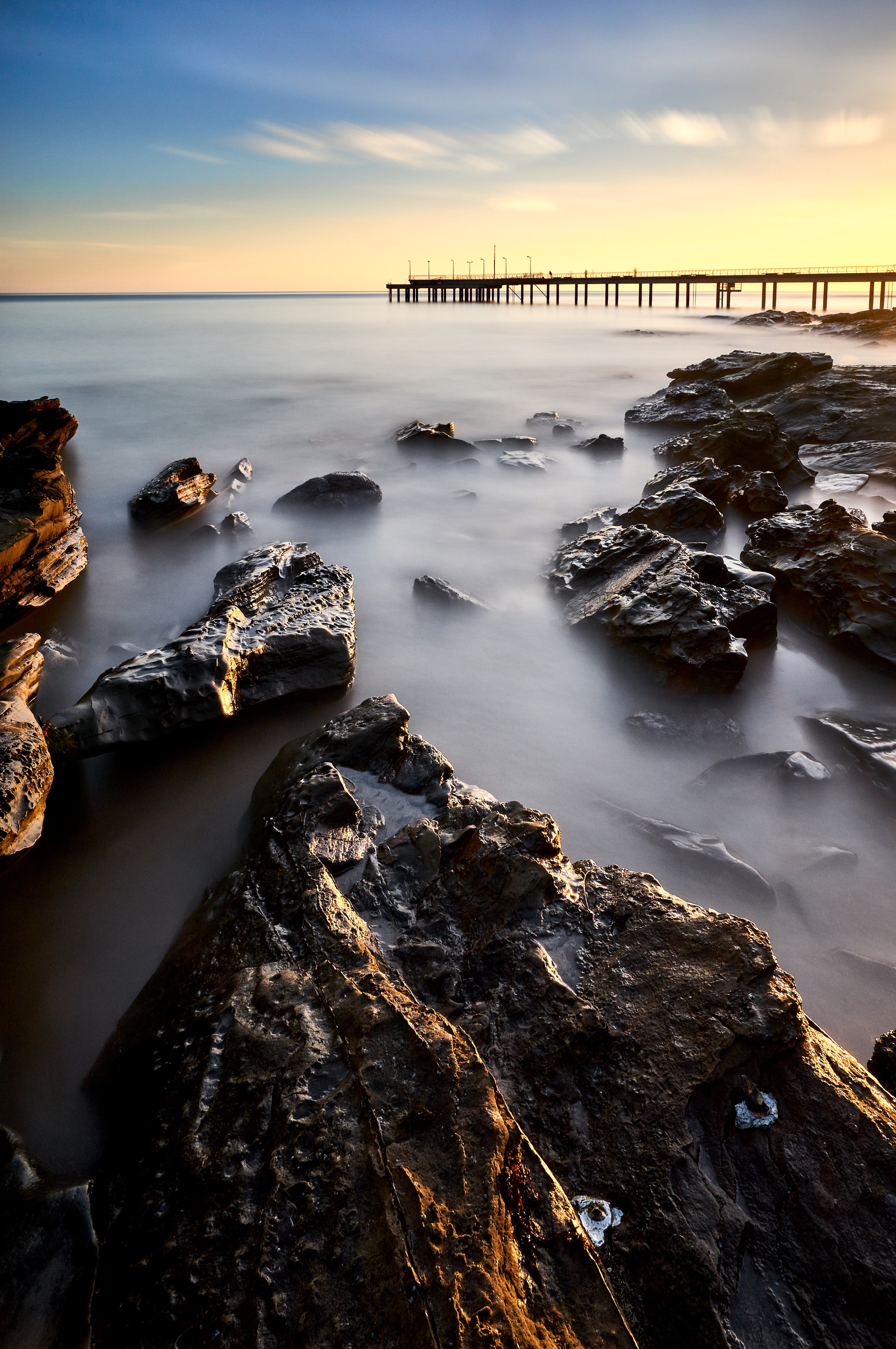
So now for the comparison—a test of sorts. I’ve placed here two images, both created from the same RAW file. The first (before) is the colour image that I took. The second (after) is its black and white ‘twin’, if I can use that conceit.
So which is it: to be, or not to be...? Does the image on the right reveal things that the image on the left doesn’t? Or does it fall short in some way because the composition isn't strong enough? Leave your comments or advice...